Marketing Services
Potato Print
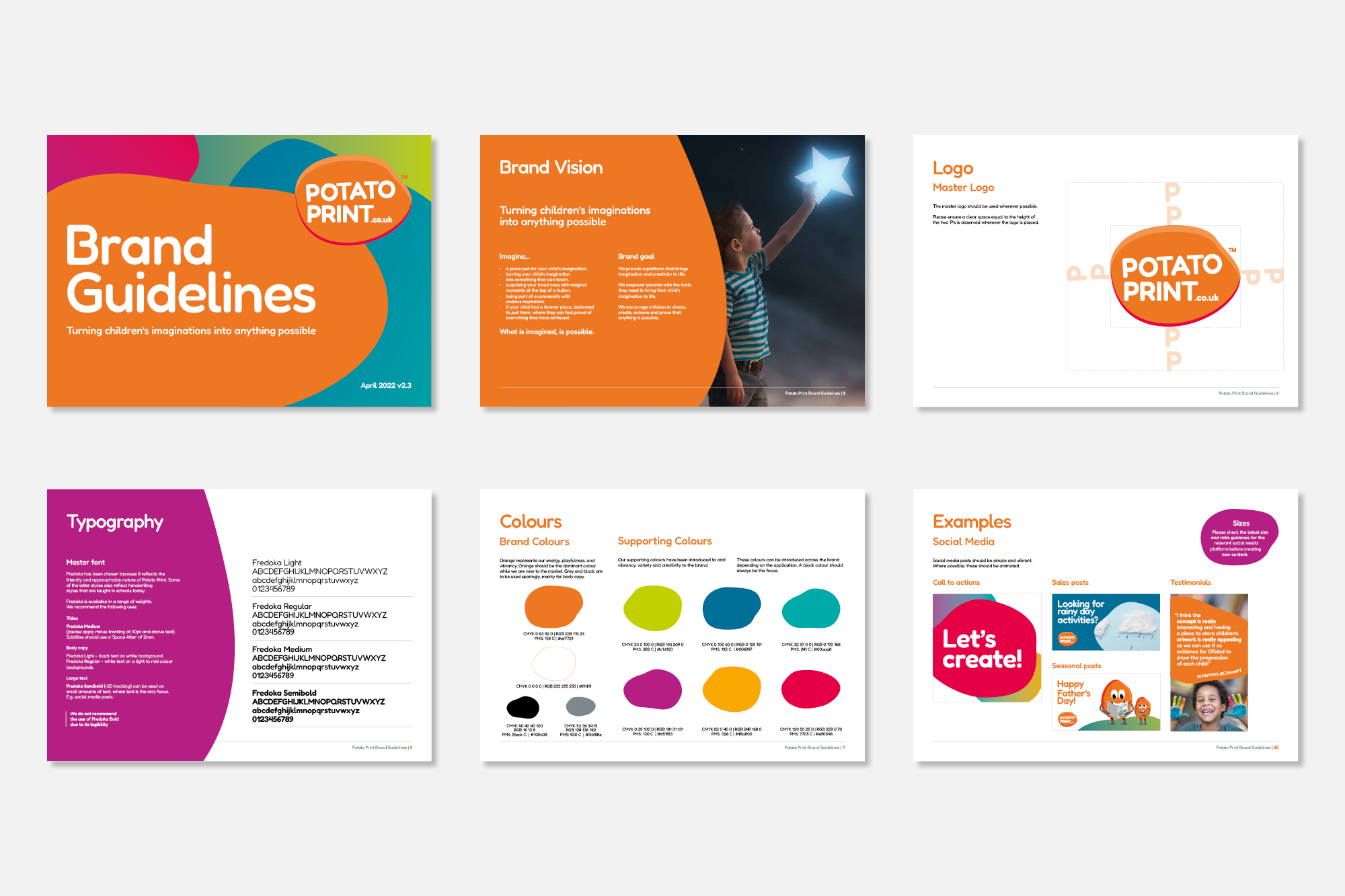
Brand guidelines
Creating a fun, engaging and modern brand
Brand / Illustration / Animation / Website
Potato Print connects parents, children and teachers through creativity and required a brand refresh to modernise and reflect their revamped offering. The brand needed to be modern, creative and vibrant, it needed to be professional, appealing to parents, teachers and children.
Our Solution
As part of modernising the brand, we enhanced the vibrancy of colours, selected a clean and friendly set of fonts, and re-worked the tone of voice. Implementing a graphic element that could be used throughout all applications, boosted brand recognition and reflected the fluid nature of creativity.
A set of characters was created to engage with the school children and enhance the storytelling of the Potato Print brand.
I was so impressed with the brand guidelines we received back from the marketing team at JD. We asked for the brand logo, colours and typography of our brand to evolve into a modern digital brand, to help us appeal to our audience. This meant a complete rebuild to the entire brand guidelines including the creation of digital assets.
When it came back to us, we didn’t even ask for any changes, it was exactly what we needed. We asked our customers what they thought to the changes, and they really loved it.
Since then, our engagement metrics online have been much higher, and our sales and marketing assets have delivered deeper impact to our customers!